Category: Website HTML

Validating the website

For the last piece of the assignment, we had to validate our website through HTML5 and CSS3 validators and fix all errors that we found. The errors that I had were very easy to fix and most of them were the repetitious. These were the following errors that I had, as well as the solutions that I implemented to solve the errors:

Screenshot_1.jpg

Screenshot_2.jpg

Screenshot_4.jpg

Screenshot_6.jpg


Screenshot_7.jpg

Screenshot_8.jpg

Screenshot_9.jpg

Screenshot_1.jpg

Screenshot_1.jpg

Merchandise page

For the last page of my website, I decided to include a store with a set of different merchandise that a potential user could purchase. I opted for simplicity in this page and instead of having a row of 4 items like the original website, I decided to use 2 items per row and make the images a bit larger. As always I used a 12 column grid, but this time each image, text-content and button was to occupy 1/2 of the grid.

Screenshot_1
Original Runescape Website
Screenshot_2
My Website

I also made my images so that when a user hovers over them the mouse cursor changes to a pointer and the image opacity is reduced after a 0.3 second delay. I also wanted to make the images so that when the user clicks on them they get enlarged, however I had some aesthetic issues with this and so decided to leave them as is.

Screenshot_3.jpg

For the buttons I used a button element and when clicked, it shows an error page which I custom designed myself, since the shop is not functional. I kept the text and design of the buttons simple, but consistent with the colour scheme of the website. The original Runescape website used a green colour which was used only for the buttons which in my opinion didn’t match with the other elements.

Screenshot_1.jpg

All in all I was very happy with the final result and how my website turned out. Can it be further improved? Yes, but since this is my 3rd website I ever designed I’m really happy with the outcome

The Hiscores page

This page was pretty straightforward with not much of functionality in it for the simple reason that it contains a list of users which have their hiscores displayed. At first I thought about doing an unordered list <ul> and have each name listed down in a list item <li>, but after inspecting the HTML code of the old school Runescape website, I saw that it made use of a table and so I decided to use that instead <td> and <tr>, since it seemed to make more sense. For the table I also used a 12 column grid with each of the following content occupying 1/4 of the grid:

  • Rank
  • Name
  • Level
  • XP

Screenshot_2.jpg

Screenshot_1.jpg

The News and Videos pages

These 2 pages were very similar to each other. The main difference between them was the content of the pages. I first started designing the news page and this was my toughest page to code where I had some aesthetic issues.

My aim for these pages was to get the images and text-content aligned accordingly however, on my first tryout I was not getting the expected result. The images were being aligned the way I wanted them, however it was not the case for the text, where I wanted the game updates and date and time, followed by the header and finally finishing off with the information content to be aligned underneath one another.

Screenshot_1.jpg

For this I was using the following code (seen below), however I was not achieving the expected result. I later asked for some assistance and learned that I had to make use of the flex property so that the text content will fill in the flexible space.

Screenshot_2.jpg

Screenshot_3.jpg

After using the flex property, the text content became much better aligned, however it was still not being aligned with the images. I later learned that the cause for this was because I was putting multiple content boxes in one list item and to arrange this, I had to repeat the <li> list items for every new item inserted into the list.

Screenshot_4.jpg

After arranging my code accordingly (as seen in image below), everything became aligned and achieved the result that I expected.

fgd.jpg

as.jpg

Screenshot_7.jpg

For my website I also wanted to include a pagination at the bottom of my page so that I could have multiple pages where the user can view older news/videos. I decided to keep the pagination consistent with the buttons and the menu navigation bar and also gave them the ‘active’ class which is the same class of the menu bar items.

Screenshot_8.jpg

Screenshot_10.jpg

Screenshot_9.jpg

The Home page

The home page – the first thing the user will stumble upon when viewing any website, and a homepage must look as inviting as possible and give out as much information about the content of the website as it can. Looking at other websites, one thing I noticed was that most of them had one thing in common which was a huge featured image at the beginning of the screen which inspired me to use that example and implement an image of my own into my website.

Screenshot_1.jpg

In the original ‘Runescape’ website, the news and videos on the homepage were separated by a menu option.

Screenshot_4.jpg

For my website redesign, I altered this and made it so that they were on the same page. For this I used a 12 column grid with each image/video and their respective text occupying 1/4 of the grid. To achieve this I made use of the ‘960 grid’ HTML/CSS framework which could be found for free online.

Screenshot_5.jpg

Screenshot_3.jpg

Task 3: My body is ready

April: Time to start coding the website.

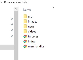
The first thing I did was create the pages and the folder structure I needed for my website. I created an images folder for all the images I was to use, the CSS files grouped up in one folder and HTML files that I was going to use.

Screenshot_1.jpg

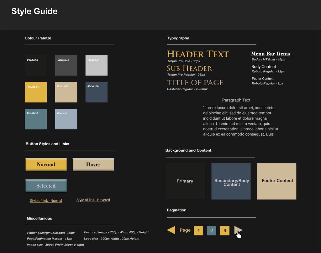
For the coding of my website I decided to use ‘Atom’ as my text editor. The first thing I did when I started coding was to address those elements which were going to be present in every page, which were the header, menu navigation bar and the footer of the website.

Screenshot_2.jpg

I really liked how the menu bar and footer turned out to be, but I can’t say the same for the header, so I decided to change the website name into an image logo and I also decided to remove they greyish background colour of the header.

Screenshot_3.jpg

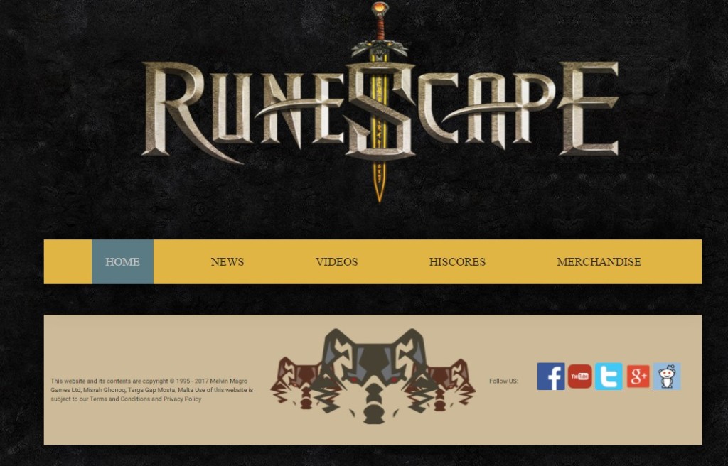
I gave the menu bar buttons a hover element as well so that the colour changes accordingly.

Screenshot_4.jpg

Screenshot_5.jpg

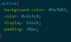
Furthermore, I created a class called active, so that every time the user clicks on a menu bar item, the colour is changed to show the active element.

Screenshot_6.jpg


Screenshot_7.jpgScreenshot_8.jpg

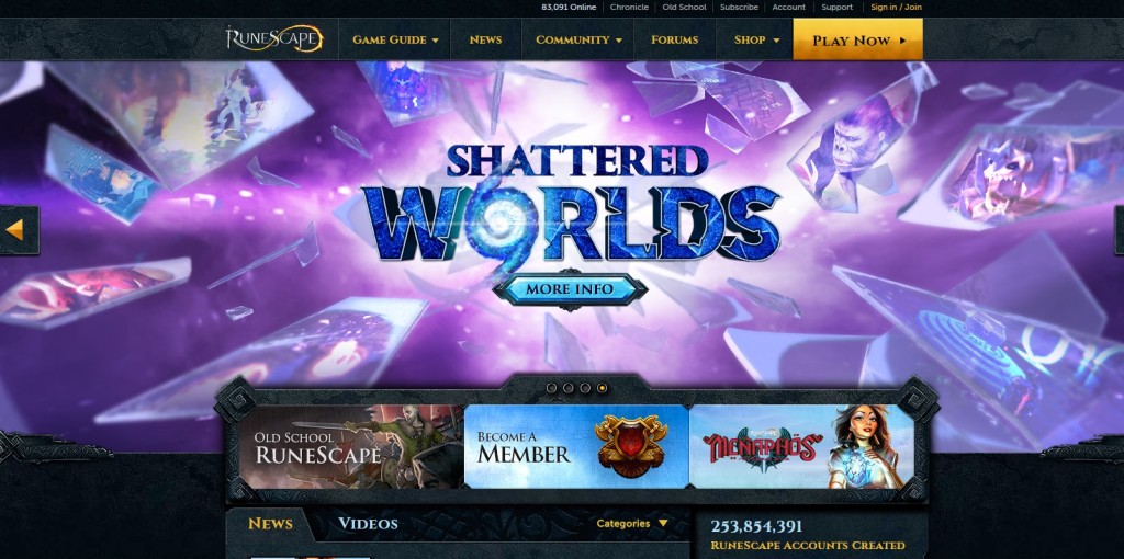
As for the footer content, I inserted my own personal logo in the centre and some other text content on the left. On the right side of the footer content I created 5 icons which when clicked on takes the user to the appropriate page where you can follow updates on the ‘Runescape’ game. I also made sure that those links had a ‘target = _blank’ element so that when the user clicks on it, the link will open in a new tab. Furthermore I made sure (for web accessibility standards) to include an alternate tag for all of the images (the logo, the header and the icons).

Screenshot_9.jpg

Task 2: I like it, but I don’t like it

After finishing task 1, I immediately started working on task 2. Basically we had to update the studied website, in my case ‘Runescape’ and improve its aesthetics and overall user experience.

The first part of the task was to think about a sitemap to outline the hierarchy of pages. I found this very easy to do since all I had were 5 pages and only the merchandise page contained 2 other sub menus

dg.png

I tried to keep my sitemap and number of menu options as simple as possible, but functional nonetheless since we had to code everything in the next task.

Next, we had to come up with at least 2 thumbnail sketches as well as digitised wireframe layouts for the planned pages. I made a thumbnail sketches and a digitised wireframe layout for each of my pages. For each of these layouts, I also included the functional links and buttons, as well as the non functional elements such as images and logos.

img1.jpg

img2.jpg

img3.jpg

img4.jpg

img5.jpg

In the next part of task 2, we also had to come up with a style guide which is used to showcase the visual representation of the website such as the colour palette of the website, the font family and font sizes of different content within our website, the button styles and links as well as the hover options, the pagination (if any) of the website and also other minor stuff such as image dimensions and paddings and margins between different elements

Style Design.jpg

This task proved to be very informative and helpful for task 3 when first starting to design a website since all the groundwork would be laid out and all that is left to do is to code the website and just follow the wireframe layouts and style guide.


Task 1

During the fourth and fifth week, I started working on the first task. In this task we had to do a visual analysis of a website and I chose ‘Runescape’ as my website, mainly because it is one of my favourite games.

Screenshot_1.jpg

I enjoyed the fact that this website used simple yet effective interactive elements, such as hovering over certain elements such as buttons and links changes colour as well as the cursor, clearly indicating that the element is clickable. The image on top showcasing the most recent update was also a nice touch and clicking on the arrows can show you previous updates.

Navigating through the website was very easy as well and it contained various accessibility features such as alt tags, descriptive links and transcripts for videos. I learned a lot about the importance of accessibility options when doing this task and kept it in mind to make sure to include them when creating websites.

  • Using subtitles or transcripts for videos
  • Using good descriptions for links
  • Making good use of colour
  • Giving clickable items a wider range
  • Simple English and easy to understand
  • Providing the user with an Accessibility Guide

In this task we also had to conduct a research on an HTML and CSS framework and I chose to do my research on bootstrap. I found that using these frameworks can save a lot of time when it comes to the design of the website since they basically make use of ready made classes and all you need to do is link them.

Get with the Program (ming)

In the second and third week, our lecturer started getting further into teaching us HTML and CSS. With Redd we were learning how to code and create an exact copy of the Facebook website.

Screenshot_2.jpg

I found most of the stuff we were doing relatively easy so I instead I helped my classmates who had never done coding before. I did however learn one new thing which was how to retrieve icons and fonts from online sources and use them for your website.

On the other hand with Andrew, we were learning more about the styling of the website instead of the coding part. Andrew taught us about grids which I found very useful and the importance of using meaningful colours when designing a website. We also started sketching on a piece of paper eight different layouts on how our website could look like.

thumbsproj005x.jpg

Back to the Basics

In the first week of this unit, we started learning from scratch and from the very beginning on how to design a website. I hadn’t used HTML in over 2-3 years and I was a little bit rusty, so the first couple of lessons helped me brush up quite a bit on HTML and CSS. Since I already had a bit of knowledge on how to use HTML and CSS, in my own time I decided to do a little bit of research and coding of my own. Sort of a side project and this is what I came up with.

Screenshot_1.jpg

I basically made a navigation menu bar since I knew that sooner or later when I had to design my website for the assignment, I would find this useful.