Category: Contextual Studies – Sharon

Pop Art

1346380977-0.jpgdownload.png

Meaning Popular Art, it was a movement that emerged in Britain in the mid 1950s and late 1950s in America after the war and was considered as an optimistic movement. Its style was flat, colourful, graphical and commercial like. It used popular imagery which was influenced by popular mass media, drawn from television, movies, comic books and advertisements and artists used similar ideas to that of Dada and abstract expressionism.

Andy Warhol was a key figure in this movement and he wanted to elevate everyday objects and boost their popularity by making drawings or use pop artists as a means to do this. This sort of reminds me of Art Nouveau since the goal is very similar; bringing out the beauty to everyday objects. This was implemented and tried on coca cola bottles and soup cans so that these objects were considered fine arts. A lot of people were sceptic about this concept. How can soup and other products alike be art? But pop artists were referencing the world in which people actually lived and as Andy Warhol put it; “Everything is Art”. Silk Screen Printing was also one of Warhol’s forte and he made it more recognisable than it was before since it wasn’t a popular medium to be used  and one famous silkscreened image that Warhol produced which is still popular today was a Marilyn Monroe photograph, which became the first of many when he realised that he could produce more art in this way.

andy_warhol (1).jpg

Other artists included Roy Lichtenstein. He painted the world like a comic strip turning comic books into high art. Notably one of his most famous paintings is WHAAM! and another being Drowning Girl. They look as if they are painted on cheap paper and have been zoomed in, just like the type that they use to create a newspaper. His work defined the premise of pop art through parody.

whaam.jpg

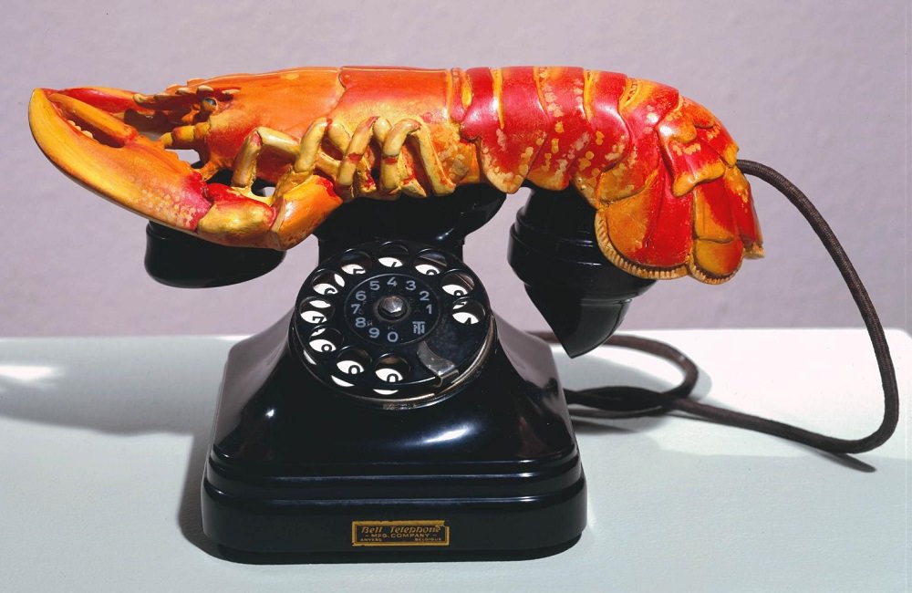
Another famous pop artist was Claus Oldenburg. What he did was use everyday objects and resize them to a monumental size which sort of questions the importance of the objects. Like why would there be a cone standing on top of a building in the middle of Cologne or a humongous peg just next to a city hall? What’s the meaning behind that and why is it so important as to make it so that everyone could see it? I think that the point which Oldenburg was trying to make here was reasoning out why it had to ONLY be up to the elite or academics to determine what is culturally important and what is not instead of the regular normal masses.

f7fb42a7b4d6a1e5311cb18812050436.jpgoldenburg_clothespin.jpg

Pop Art is one of the most recognisable movements of the 20th century and is still very much popular AND a part of popular culture, but not all people take it seriously and see it as a form of art. Pop Art has actually brought out attention to how other artistic practises such as film making, packaging, brand design and performance can be just as artistic as the so called “high art” pursuits, such as painting and sculpting.

References


Visual-arts-cork.com. (2017). Pop Art: History, Characteristics. [online] Available at: http://www.visual-arts-cork.com/history-of-art/pop-art.htm [Accessed 24 Jan. 2017].

The Art Story. (2017). Pop Art Movement, Artists and Major Works. [online] Available at: http://www.theartstory.org/movement-pop-art.htm [Accessed 24 Jan. 2017].

En.wikipedia.org. (2017). Pop art. [online] Available at: https://en.wikipedia.org/wiki/Pop_art [Accessed 24 Jan. 2017].

Tate.org.uk. (2017). Pop art. [online] Available at: http://www.tate.org.uk/learn/online-resources/glossary/p/pop-art [Accessed 24 Jan. 2017].

The Bauhaus

bauhaus-003.jpg

The Bauhaus (building house) was an art school founded by the architect Walter Gropius in the German city of Weimar in 1919 just after World War I. The Bauhaus was influenced by the Arts and Crafts movement, as well as Constructivism, but most importantly, it was highly influenced by Modernism.

The Bauhaus gave its students theoretical and practical training in all of the fine arts including typography, ceramics, metalwork, stone sculpture, stained glass, book binding and woodworks so as to teach them how to use these fine art skills with new technologies and be able to design and manufacture products that were both beautiful and practical at the same time. The aim was to unite the artist and the craftsman so that they can work harmoniously together, since technology and the machine age was clearly the new future and there was this fear that the art’s purpose would be lost in society.

The Bauhaus attracted a lot of famous artists and some of them taught at the Bauhaus. Some of these included Paul Klee, Wassily Kandinsky, Johannes Itten and Lyonel Feininger. The De Stijl founder and architect Theo Van Doesburg taught a course as well at the Bauhaus in 1922 which became an influence as well. Below is an image painted at the Bauhaus under the influence of De Stijl. This is clearly visible by the geometric shapes and straight lines as well as the primary colours (Red, Blue, Yellow) and non colours (Black, White, Grey). It is also an asymmetrical artwork; another characteristic of De Stijl.

Image result for bauhaus art.

 In 1923, the first Bauhaus exhibition took place in Weimar. In 1925 the school opened in Dessau and finally in Berlin in 1932. Karte-16.jpg

Notable works at the Bauhaus…

Herbert Bayer –  both a student and a teacher at the Bauhaus. He took part in quite a wide range of fields while learning there, as did all other students there, because the Bauhaus strived to teach its pupils to not just stick with only one movement, but explore others as well and make use of different mediums. At first Bayer studied painting with Kandinsky, but after a while he became a teacher of typography. His designs there did not go unnoticed and Bayer went on to create the geometric Universal sans serif alphabet. The typeface was clear and simple and did not include any capitals in it. It was an influence to Paul Renner’s Futura typeface in 1927.

99866ed644044e9178865faea2d459ce.jpg

Perhaps one of the most notable piece of work at the Bauhaus was the Wassily Chair which was designed by Marcel Breuer, a Hungarian born modernist who taught a lot of architects at the Bauhaus. This chair made the Bauhaus famous and it was actually inspired by a bicycle since it used tubular steel as a metal. Breuer reasoned that if the metal could be bent into handlebars, then it could just as easily be turned into furniture. Another design which imitates this chair and was designed by the same architect is the Cantilever chair. These are very common and could be found everywhere nowadays. They remain popular to this day.

cri_000000210783.jpg
Wassily Chair

bbbe155392528dc666a7f36523cae620.jpg
Cantilever Chair

The Bauhaus had a great recurring influence on art and architecture trends in Western Europe, USA, Canada and Israel after the Nazis took down the Bauhaus in 1933. New schools opened after that, following the trends of the Bauhaus, such as the Ulm School of Design in 1953 by Max Bill, Otl Aicher and Aicher Scholl.

References

En.wikipedia.org. (2017). Bauhaus. [online] Available at: https://en.wikipedia.org/wiki/Bauhaus [Accessed 24 Jan. 2017].

The Art Story. (2017). Bauhaus Movement, Artists and Major Works. [online] Available at: http://www.theartstory.org/movement-bauhaus-artworks.htm [Accessed 24 Jan. 2017].

Flask, D. (2017). Herbert Bayer : Design Is History. [online] Designishistory.com. Available at: http://www.designishistory.com/1920/herbert-bayer/ [Accessed 24 Jan. 2017].

Winton, A. (2017). The Bauhaus, 1919–1933 | Essay | Heilbrunn Timeline of Art History | The Metropolitan Museum of Art. [online] The Met’s Heilbrunn Timeline of Art History. Available at: http://www.metmuseum.org/toah/hd/bauh/hd_bauh.htm [Accessed 24 Jan. 2017].

Russian Suprematism and Constructivism


Image result for constructivism and suprematism

While the Dada artists were busy being pessimistic and rebellious against World War I by using anti-art and opposing everything which art stood for in Zurich, Switzerland, other avant-garde artists were searching for a more suitable and idealistic artistic change. Kazimir Malevich from Russia, was a pioneer who founded Suprematism in 1913, one of the earliest type of geometric abstract art. This art movement consisted mainly of basic geometric shapes and forms including; lines, rectangles, circles, the cross and squares and made use of a limited range of colours. Furthermore, Suprematism did not rely on any realistic images. In a book written by Malevich himself “The Non Objective World“, he explains that the term Suprematism is a reference based upon “the supremacy of pure artistic feeling rather than on visual depiction of objects”.

Suprematism was a movement which was influenced by Futurism and Cubism. For Malevich, it was a style which was purer, more truthful, and held no distractions by relying on realism. The first ever Suprematist painting was the Black Square. But why a simple monochromatic black square? Where’s the art in that? Well, in his book Malevich tells us that he always wanted to free art from the real world and so he did by using the black square. It was also the first time someone made a painting that wasn’t of something (abstract).

Kazimir-Malevich-Supremus-No.-58.jpg
Supremus No. 58 – Kazimir Malevich

Supremus No. 58 is the perfect example of Suprematist art. It is an artistic design containing only geometric shapes and forms and visually the object which we are seeing is in itself meaningless, but what the artist wants to bring forward from this motif, is pure feeling. Malevich feels like he is a god with this painting, for the simple reason that he created something that has never existed before and no matter in which direction you turn the painting, it makes absolutely no difference to your understanding of the work, since the painting does not follow any law of physics, has no up, no down and is not ruled by gravity.

Constructivism was another artistic movement which originated in Moscow, Russia by Vladimir Tatlin and got most of its ideas from Suprematism, Cubism and Futurism, but Constructivism was all about creating art that actually mattered and constructing useful, artistic objects and to get rid of the idea of “creating art for art’s sake” while finally starting to put the use of art for the benefit of the industry and create functional objects. Like Suprematism, they both use geometric shapes and objects and are both abstract, with the only difference being that Constructivism wanted to literally construct (usually in 3D) abstract works for the benefit of the social cause instead of just leaving them as paintings. So the only difference is primarily more ideological, rather than aesthetic


b8b0b1cd804470b6fc08b81ead7d3693.jpg
Monument to the Third International


This monument was designed by Vladimir Tatlin, one of the most iconic constructivists there was. It is a design which was meant to be built and act as a fully functional conference space, but this model was never really built. When looking at it, it kind of reminds me of the Eiffel tower. There is a slight resemblance to it and if this was actually built, it would’ve been an iconic structure which would even be as popular, perhaps even more so than the Eiffel tower.

Constructivism left a great influence on the De Stijl and the Bauhaus movements and we also still see its effects on nowadays objects. IKEA Home Furnishings for example has a lot in common with Constructivism’s principles. Tatlin once said: “Not towards the old, nor towards the new – but towards the necessary!” and well, IKEA seems to do just THAT.

.


References

Study.com. (2017). The Art Movement Suprematism: Definition & Artists | Study.com. [online] Available at: http://study.com/academy/lesson/the-art-movement-suprematism-definition-artists.html [Accessed 21 Jan. 2017].

Zythepsary.com. (2017). Suprematism and Constructivism. [online] Available at: http://zythepsary.com/art20scourse/construct.html [Accessed 21 Jan. 2017].

Holtham, S. and Moran, F. (2017). Five ways to look at Malevich’s Black Square. [online] Tate.org.uk. Available at: http://www.tate.org.uk/context-comment/articles/five-ways-look-Malevich-Black-Square [Accessed 21 Jan. 2017].

The Art Story. (2017). Constructivism Movement, Artists and Major Works. [online] Available at: http://www.theartstory.org/movement-constructivism.htm [Accessed 21 Jan. 2017].

Aldersey-Williams, H. (2017). Constructivism: the ism that just keeps givin’ – Creative Review. [online] Creative Review. Available at: https://www.creativereview.co.uk/constructivism-the-ism-that-just-keeps-givin/ [Accessed 21 Jan. 2017].

Task 3 Groupwork Art Nouveau

Lombard Bank

DSC_0508.JPG

Lombard bank is one of the few Art Nouveau buildings left standing here in Malta. It is found in Tower Road, Sliema and was designed by architect Giuseppe Psaila back in 1914. At the time it was built as a house and by time, it began to slowly crumble and fall into bits and pieces since it was left abandoned for a number of years. A building permit was in fact issued for the house to be knocked down and a block of apartments to be built instead, but Lombard Bank managed to restore this nostalgic building just in time. Together with my group we came to visit this building and capture a few shots of it, to use for our presentation.

So what makes this building Art Nouveau style? Well for starters it has a lot of floral patterns covering the building and also contains markings as well as engraved leaves on its facade which is another indication of Art Nouveau. Furthermore if one were to take a look at the fence, it has a spiral like design which looks as if they are butterflies or vine tendrils; natural elements which are characteristics of Art Nouveau. The windows also have these flowing and twisting lines as well which from my perspective looks as if they are butterfly wings. Not quite sure if it’s intentional or pure coincidence though. The windows are also gilded; another Art Nouveau characteristic.

The only thing I criticise are some of the symmetrical lines found along the facade for the simple reason that Nouveau style is quite asymmetrical when it comes to lines.

Cafe Jubilee


Screenshot_1.jpg

The next place we decided to visit was Cafe Jubilee in Gzira. This cafe was filled with all sorts of Art Nouveau paintings and posters and other decorative arts. A poster which I really liked and gave me a euphoric feeling was this one that I saw upon entering the cafe. It depicts an elegant woman ice skating at Palais De Glace in Argentina (hence the name of the poster). I tried ice skating myself and it reminds me of the good times I had, so I liked this poster a bit more and it is indeed a fine poster. It is a replica of Jules Cheret’s poster which he painted using litography back in 1893.


Art Nouveaue piece.jpg

The painting above though was in my opinion the best there was in that cafe. It is a replica painted by Carlino Geifo and it represents the famous set of decorative panels which Alphonse Mucha painted back in 1896 [see image below]

The Seasons.jpg

This is The Seasons painting and the one which we see in the cafe portrays the summer season. Summer is portrayed by a brunette with a wreath of red poppies and she is in a serene mood, leaning against a grapevine. Apart from the obvious swirling whiplash curves in her hair and the plants this painting has to offer, I also really like the carnation pink used for her dress; a muted colour which is another characteristic of Art Nouveau.

AN2.jpg

Last but not least I also wanted to include this bench which was also present in the cafe and is in Art Nouveau style as well with its consistent floral patterns and curved line which makes for the support of the bench.

Surrealism

Surrealism was founded in 1924 by Andre Breton with the publication of the Manifesto of Surrealism and was a literary movement that experimented with a new mode of expression called automatism, which was basically a way of tapping into the unconscious mind and create art using the subconscious. Breton, along with other French writers and poets were greatly influenced by the theoretical work that Sigmund Freud did with regards to dream studies, particularly by the book that Freud wrote; “The Interpretation of Dreams” in 1899. In his book he mentions the importance of dreams and how they are valid revelations of human emotion and desires. Freud once said and I quote “A dream that is not interpreted is like a letter that is not opened.”

Breton says that “pure psychic automatism” was the most important principle of Surrealism. He believed that true surrealists had no real talent; they just spoke their thoughts as they happened in their unconscious mind and ‘revealing the language of the soul’.

Surrealism emerged from Dada and also had a few elements of Cubism and Expressionism; in fact many surrealists and poets were ex-dadaists, including the founder of Surrealism (Andre Breton) and many characteristics of Surrealism were built on Dada ideas. Dadaism had no rules,truths or beliefs unlike Surrealism which was easier to understand, based mainly on the idea of the subconscious and dreamlike imagery and it’s mission wasn’t to be “anti-art”, like Dada was. It was a less violent art and more artistically based and was a revolutionary movement which restored faith and lifted up a man’s spirit.

A common technique which Surrealists use is the juxtaposition of objects. This is when two or more objects are put together where they do not make sense at all under normal circumstances, but when combined together, makes for great art. A great example of this is seen in Salvador Dali’s  “Lobster Telephone” (1936), something which is both playful and menacing. Juxtaposition can be used to show a metaphor or to convey a certain message. In this case, the lobster’s tail, where its sexual parts are located, is placed directly over the mouthpiece, which for Dali, lobsters and telephones had strong sexual connotations, hinting erotic pleasure.


lobster-telephone.jpg

Many surrealist artists painted very realistically but had one object that changed the painting entirely.

René Magritte (1898–1967)

A Belgian artist who became a leading figure in Surrealism. Magritte was influenced by Giorgio de Chirico’s paintings and mostly enjoyed painting erotic images juxtaposed in dreamlike surroundings. In the image below, Magritte presents us with a bizarre image of a fish with legs of a woman, which in my opinion, reminds me greatly of a reversed mermaid, as if it is mocking the usual picture we have of a mermaid and is telling us: “So what if it was the other way round? What’s so bad about it?”. It is eerie and unsettling, but nonetheless, artistic and beautiful and a true example of Surrealism, since it taps into our unconscious mind and make us really think about it.

the_collective_invention.jpg
The Collective Invention – Rene Magritte

Surrealist art continues to have an impact on today’s fashion, art, architecture and furniture design.

Screenshot_1.png

modern-architecture02.jpg

The Art Story. (2017). Surrealism Movement, Artists and Major Works. [online] Available at: http://www.theartstory.org/movement-surrealism.htm [Accessed 3 Jan. 2017].

Arthistoryarchive.com. (2017). The Origins of Surrealism. [online] Available at: http://www.arthistoryarchive.com/arthistory/surrealism/Origins-of-Surrealism.html [Accessed 3 Jan. 2017].

Visual-arts-cork.com. (2017). Surrealism Art Movement. [online] Available at: http://www.visual-arts-cork.com/history-of-art/surrealism.htm [Accessed 3 Jan. 2017].

Voorhies, A. (2017). Surrealism | Essay | Heilbrunn Timeline of Art History | The Metropolitan Museum of Art. [online] The Met’s Heilbrunn Timeline of Art History. Available at: http://www.metmuseum.org/toah/hd/surr/hd_surr.htm [Accessed 3 Jan. 2017].

De Stijl


ec42cd14035607.56358adea920d.jpg


An art movement which made an appearance in response to the horrors of World War 1 and looked at art as a means to revive society in its aftermath. It was a universal visual language for a new world which was a response to the over-decorative art-deco style.

De Stijl (also known as Neo-Plastisticism) was a Dutch movement founded in Amsterdam and led by the painters Theo van Doesburg and Piet Mondrian in 1917. This artistic style was influenced by Picasso and Braque’s Cubism, Malevich’s Suprematism and Tatlin’s Constructivism as well as the anti-sentimentalism of Dada. Its characteristics was clearly defined by Mondrian where he explained his theory: “this new art will find its expression in the abstraction of form and colour, that is to say, in the straight line and the clearly defined primary colour”. In a nutshell, De Stijl is restricted to the use of:

  • Straight line/right angles/vertical and horizontal
  • Squares and Rectangles
  • Pure Primary Colours (Red, Blue,Yellow)
  • The so called non colours (Black, White, Grey)
  • No curves, no diagonals, no circles
  • Avoidance of Symmetry; use of asymmetry instead
  • Bold colours should balance bold direct lines

Theo van Doesburg

Theo Van Doesburg (1883 – 1931) – a Dutch artist who was the founder of the De Stijl group in 1917. Vincent Van Gogh was an inspiration to this artist, both in style and subject matter.

Doesburg practiced painting, writing, poetry and architecture and during his life, created numerous abstract paintings and designed buildings, room decorations, stained glass, furniture, and household items using simplified geometric style as his main element. During his life, Doesburg wrote a number of essays and treatises regarding geometric abstraction and De Stijl. He published journals as welland exhibited quite a number of exhibitions which he organized himself, with most of the works being that of De Stijl and similar movements.

In 1921, van Doesburg visited Berlin and Weimar and a year later started teaching at the Weimar Bauhaus where he met other famous artists including Le Corbusier, Ludwig Mies van der Rohe, Raoul Hausmann and Han Richter. During this time, he was intrigued with Dada and worked alongside Kurt Schwitters among other artists where they both influenced each other in their works (Mecano magazine), using the De Stijl principles that van Doesburg had to offer.

Theo van Doesburg, Composition in Gray (Rag-time), 1919. Oil on canvas, 38 x 23 1/4 inches (96.5 x 59.1 cm)
Composition in Grey

Composition in Grey – One of Theo van Doesburg’s works. He says and I quote “nothing is more real than a line, a color, a surface.” This can be related to his artwork. He makes use of cubist elements and use of monochrome in this piece of art.

Piet Mondrian

Another pioneer and influential Dutch artist in the De Stijl movement. Born in 1906, Piet met Theo van Doesburg and Bart van der Leck where he was influenced by the use of primary colours and the precision of the vertical and horizontal lines that van der Leck was using and so started working alongside these 2, the time when the De Stijl was formed.

Piet loved the abstractism and the use of asymmetrical balance and simplified pictorial vocabulary were crucial in the development of modern art. Furthermore, the abstract artworks he made is still seen nowadays in many different designs.


De Stijl had a huge influence on the Bauhaus style and the international style of architecture, clothing and interior design.

stringio(21).jpg

Rietvield Schroder House, the only building to have been creted completely according to De Stijl Principles, built in 1924 by  architect Gerrit Rietvield


References

Theartstory.org. (2016). The Art Story: Modern Art Movement Timeline. [online] Available at: http://www.theartstory.org/section_movements_timeline.htm [Accessed 20 Dec. 2016].

The Art Story. (2016). Theo van Doesburg Biography, Art, and Analysis of Works. [online] Available at: http://www.theartstory.org/artist-van-doesburg-theo-artworks.htm [Accessed 20 Dec. 2016].

Visual-arts-cork.com. (2016). De Stijl: Dutch Abstract Art Group: Characteristics, History, Manifesto. [online] Available at: http://www.visual-arts-cork.com/history-of-art/de-stijl.htm [Accessed 20 Dec. 2016].

Visual-arts-cork.com. (2016). Neo-Plasticism: Definition, Characteristics, History. [online] Available at: http://www.visual-arts-cork.com/history-of-art/neo-plasticism.htm [Accessed 20 Dec. 2016].

Sweeting, B. (2016). The Essential Artworks By Theo Van Doesburg To Know. [online] Culture Trip. Available at: https://theculturetrip.com/europe/the-netherlands/articles/the-best-artworks-by-theo-van-doesburg-you-should-know/ [Accessed 20 Dec. 2016].

Dadaism

Dadaism – an anarchic art movement which was founded by Hugo Ball at the Cabaret Voltaire in Zurich with his companion Emmy Hennings and other artists on February 5, 1916, however dadaist ideas were already surfacing in other places. Dada was born out of a negative reaction and a rebellious movement for the social, political and cultural values at the time, which was believed to have had an impact and given support to the horrors of the First World War.

Dada was Influenced by other avant-garde movements including Cubism, Futurism, Constructivism, and Expressionism and had a varied range of artistic forms such as performance art to poetry, photography, sculpture, painting, and collage. Dada employed ideas of random choice and also took it to extremes by using materials such as ephemera and rubbish. Even the word “Dada” itself was a nonsensical, meaningless word picked off randomly from a German-French dictionary. This mockery of materialistic and nationalistic attitude, left a powerful influence on many artists, especially young ones, in many cities, including Berlin, Hanover, Paris, New York, and Cologne, all of which generated their own groups.

According to Hans Richter, Dada was not art: it was “anti-art.” Dada was a scream for help, wanting to express its feelings towards the First World War by opposing everything which art stood for. Where art was concerned with traditional aesthetics, Dada ignored aesthetics. If art was to appeal to sensibilities, Dada was intended to offend. Dada rejected reason and logic, prizing nonsense, irrationality and intuition. In a nutshell, Dadaism’s aim was meant to provoke and disturb art by making use of provocative works.

Kurt Schwitters –  one of the leading forces behind Dadaism. Schwitters, who was influenced by Expressionism and Cubism was the inventor of his own form of Dada in Hanover called ‘Merz’. He made use of rubbish materials in his works such as labels, bus tickets, laundry receipts, newspaper clippings and bits of broken wood in his collages and constructions. One of his most famous pieces of artwork was “Revolving”. This was created by taking found objects in the street such as cord, hoops and wire mesh and carefully merging and unifying them together on to the canvas, while also organising them to form lines and shapes, after which a few yellow and blue paint is added for that small hint of shading.

tjk.png
Revolving (1919)


John Heartfield – Heartfield was also a pioneer in his time, using art to fight the Nazis and the communism and protesting the people’s suffering in the Dada movement through his art. Heartfield is credited  as the founder of photomontage, together with artist George Grosz which he collaborated greatly with. Together, they also founded Die Pleite; a satirical magazine used to raise awareness. Heartfield also created book jackets for authors as well as stage sets and was also a member of the KPD group and a member of Berlin Club Dada. He is best known for political montages, created to expose the German Nazis.

2+Heartfield+Hitler.jpg

Another piece of important art which has to be mentioned when we speaking Dadaism is the “Fountain” which was designed (well more like transformed) by famous artist Marcel Duchamp in 1917; a ready made urinal turned upside down and labeling with a fake name, the “Fountain”, it is an iconic piece of transformed art in the Dada movement which makes us question art. Is it the idea? Is it the concept? Can an artist just have the idea and not make the object? Can art simply be theoretical?

hh.jpg
The “Fountain”


Dada ceased to be effective after 1922 however ironically, despite the aim of Dadaism wanting nothing to do with art itself, Dada still influenced and refined several important innovations in fine art, including collage and photomontage, and went on to influence several later modern art movements, such as Surrealism and Pop-Art and later on in the 1980s and 90s, there was a revival of Neo-Dada.

References

The Art Story. (2016). Dada Movement, Artists and Major Works. [online] Available at: http://www.theartstory.org/movement-dada.htm [Accessed 19 Nov. 2016].

En.wikipedia.org. (2016). Dada. [online] Available at: https://en.wikipedia.org/wiki/Dada [Accessed 19 Nov. 2016].

The Art Story. (2016). Kurt Schwitters Biography, Art, and Analysis of Works. [online] Available at: http://www.theartstory.org/artist-schwitters-kurt-artworks.ht [Accessed 19 Nov. 2016].

John Heartfield Exhibition. (2016). John Heartfield Art From Dada To His Famous Anti-Fascist Photomontages. [online] Available at: http://www.johnheartfield.com/John-Heartfield-Exhibition/john-heartfield-art [Accessed 19 Nov. 2016].

Dadart.com. (2016). Dada and dadaism : conclusion. [online] Available at: https://www.dadart.com/dadaism/dada/026-conclusion.html [Accessed 19 Nov. 2016].

Art Nouveau cont’d – post 4

Art Nouveau in France

Hector Guimard – a well-known architect born in 1867 from Lyon, France, contributed greatly to the French Art Nouveau. Guimard first became famous when he designed the Castel Béranger and after receiving numerous commissions, Guimard continued devoting himself to working in his own way with Art Nouveau using nature, flowers, and trees in his designs consisting of harmony and continuity, which led to the interior furnishings and decoration of his buildings as well in which finally between the years 1909 and 1912, Hotel Guimard was built, with its asymmetric facade and balconies with sculpted whiplash curves which was and influence left on him by Victor Horta.

Guimard’s most successful design work was the “Paris Metro entrance” which was based on the ornamented structures of Viollet-le-Duc (another famous French architect) once again showing the design in what seems to be swollen flowers, but are actually amber glass lamps. The Metro was intended to make the underground travelling experience better for the people.


jj
Castel Beranger
jj
Paris Metro


René Lalique – a Frenchman born in 1860, was a famous glassmaker who also put forwards the Art Nouveau movement and was one of France’s foremost Art Nouveau jewellery designer. In the eraly 1900s, he had won a lot of competitions and also created jewellery for the infamous actress of that time; Sarah Bernhardt. Lalique was very creative and did all sorts of glass art including perfume bottles, chandeliers, vases clocks etc etc.

In 1905 René Lalique exhibited his jewellery and also the glass objects that he himself crafted in his workshop and a perfumer named François Coty was so impressed by the designs, that he asked Lalique to join him in the perfume industry which made buying perfume in quality design bottles affordable for the first time. More perfume bottle designs soon then followed and Lalique devoted himself to more industrial techniques of glass production where he was to become a great Art Deco master glassmaker.

Lalique’s designs and brilliance in glassmaking art during the Art Nouveau period were mostly influenced by both the French countryside and also Japanese natural art motifs as well and he showed these in the glasswork and jewellery he made that many designers during his time didn’t and this was what made Lalique’s artistry so special and a true artist of his time.

Screenshot_3.png
One of Lalique’s works


The Vienna Secession in Austria 

Found in 1897 and was led by Gustav Klimt, Kolomon Moser, Hoffmann, Olbrich and others. This style unfolded from symbolist paintings and French Nouveau which they merged together with Scottish style of Charles Rennie Mackintosh. The idea behind the formation of the Secession was to get rid and withdraw from Historicism and move towards a more modern Austrian art using movements and styles that was going on during that time, including Post-Impressionism and Expressionism and also Art Nouveau’s decorative and fashionable art style. Seccessionists adopted many of the ideals of William Morris and the arts and crafts movement and their preferred  style for their motifs was the rococo style, using elaborate ornamentation, asymmetrical values, pastel color palette, and curved or serpentine lines in their designs.  In 1905 Gustav Klimt, Hoffman and others broke from the Secession due to disagreement between the artists.

images.jpg
The Kiss (Gustav Klimt)
hhdf
Secession Hall (Joseph Maria Olbrich)


Modernisme in Spain

Modernisme kicked off by a printing house commissioned in 1879 where instead of the norm; the stone facade; red bricks were used combined with iron and clay sculptural details. Later on, in Barcelona, the Spanish architect Antonio Gaudi became a precursor of Art Nouveau. Employing medieval Spanish traditions, Gaudi, like Sullivan, created a uniquely personal style and he also introduced a new technique where Gauid made use of waste ceramic pieces. His work was influenced by his passions in life: architecture, nature, and religion. He used a combination of typical Spanish materials such as wrought iron and colorful tile with cast concrete, stained glass and also carpentry to create fantastic structures in an unusual Art Nouveau idiom. Gaudi’s plans and structural models for the still uncompleted Church of the Sagrada Familia (Sacred Family), begun in 1883, show his power of invention as an engineer.

krs
Gaudi’s Sagrada Familia church


Art Nouveau in Other Countries

There were many other great and famous Art Nouveau artists across Europe and also America. As previously mentioned, in Belgium, we have Victor Horta, an architect and designer who was considered as: “the key European Art Nouveau architect”.

Eugene Grasset, from Switzerland who was an admirer of Japanese art, influenced most of his designs was also a recognisable figure in Art Nouveau.

In England, the infamous Aubrey Beardsley who travelled to Paris and was influenced by Henri de Toulouse-Lautrec and also the Parisian fashion for Japanese prints. Beardsley was well known for his dark and perverse images and grotesque erotica, illustrated in black and white.

Louis Sullivan, the teacher of Frank Lloyd Wright, an American art Nouveau architect who made use of ancient Celtic designs, incorporating them in the decoration of his otherwise functional buildings, such as the Auditorium Building (1889) and the Carson Pirie Scott Department Store, both in Chicago and last but not least, Will Bradley, an illustrator and artist who had works relatively similar to those of Aubrey Beardsley.


BeFunky Collage.jpg


References

Rlalique.com. (2016). Rene Lalique Biography – Rene Lalique History: RLalique.com. [online] Available at: https://rlalique.com/rene-lalique-biography [Accessed 16 Nov. 2016].

Lalique. (2016). Lalique timeline | A brief history of Lalique, from René Lalique to Lalique. [online] Available at: http://www.lalique.com/en/world-of-lalique/lalique-timeline [Accessed 16 Nov. 2016].

Ian C. Mills, C. (2016). Art Periods in France: ART NOUVEAU. [online] Discoverfrance.net. Available at: http://www.discoverfrance.net/France/Art/nouveau.shtml [Accessed 16 Nov. 2016].

Artnouveau.pagesperso-orange.fr. (2016). Art Nouveau in France. [online] Available at: http://artnouveau.pagesperso-orange.fr/en/pays/france.htm [Accessed 16 Nov. 2016].

Visual-arts-cork.com. (2016). Vienna Secession: History, Characteristics. [online] Available at: http://www.visual-arts-cork.com/history-of-art/vienna-secession.htm [Accessed 16 Nov. 2016].

En.wikipedia.org. (2016). Antoni Gaudí. [online] Available at: https://en.wikipedia.org/wiki/Antoni_Gaud%C3%AD [Accessed 16 Nov. 2016].

Jugendstil in Germany – Post 3

Jugendstil (in German “Youth Style”) got its name from the Munich periodical Die Jugend, which was a German art magazine. Jugendstil was inspired by both English and Japanese art (notably ukiyo e prints) which made use of “floral” designs and later on, abstract art was also introduced in Jugendstil which was an influence submitted by the famous Belgian architect Henry Van De Velde. Furthermore, Paul Gaugin, Aubrey Beardsley and Alphonse Mucha were all great influences to the growth and development of Jugendstil.

Hermann Obrist was a sculptor and a textile artist who contributed to Jugendstil. One of his famous works include Cyclamen; a floral, naturalistic, embroidered drawing of a flower with moving and violent flowing, looping curves. It later became known as The Whiplash and was an influential work of art in Art Nouveau.

csm_obrist_peitschenhieb_e3397042e1
Cyclamen

Otto Eckmann was yet another prominent figure of the “floral” branch of Jugendstil. He was a successful painter at first, but in 1894 decided to  leave painting and move onto graphic and crafts design where he designed graphical works for the magazines Pan and Jugend. These magazines contributed greatly in the development of Jugendstil as well and printed illustrations of both famous and unfamous young artists were published. Eckmann is best known for having created the Eckmann typeface, which was based on Japanese calligraphy and that is still used today.

eckmann-cna1360798586407.png

As mentioned before, Henry Van De Velde, left a great impact on Jugendstil by his abstract designs (Van De Velde was influenced by John Ruskin and William Morris’ Arts and Crafts concept), mainly by his original, curvilinear approach to furniture design and the geometrical and abstract style began to take place. Famous artists such as August Endell, Hermann Obrist and Peter Behrens began to show this abstract/geometrical style in their designs and as a result, a surreal look started taking hold instead of the “floral” whiplashed lines. Van De Velde started receiving commisions on office furniture from German art critic Julius Meier-Graefe, founder of Pan and he became very popular in Germany while receiving great amounts of commisions for his designs.

Van de Velde opted against copying historical styles , instead, going for a more original design, banning banality and ugliness from people’s minds. He then settled in Berlin, where he lectured throughout Germany.

006_van-de-velde_theredlist
Designed by Van De Velde


Meanwhile, with the growing interest in industrial design and applied arts, German designers wanted to improve their products and wanted to standardize and rationalize forms for machine production in order to produce machine made good of good quality similar to that of craftsmen and opted for designs which had less ornamentation (simpler designs) and the Vereinigte Werkstatten fur Kunst und Handwerk (United Workshops for Art and the Handicrafts) were founded in Munich in 1897.

Later on, the German Werkbund was founded in order to better improve and promote German design in order to establish a better relation between industry, ornamentation and functionalism and also to compete with British and American markets by producing high quality goods for mass consumption. Jugendstil clearly had a great impact and influence by the experimentation it fostered and made many improvements to the graphical design aspect.

yy.l;.png

References

Visual-arts-cork.com. (2016). Jugendstil: Art Nouveau in Germany. [online] Available at: http://www.visual-arts-cork.com/history-of-art/jugendstil.htm [Accessed 12 Nov. 2016].

En.wikipedia.org. (2016). Otto Eckmann. [online] Available at: https://en.wikipedia.org/wiki/Otto_Eckmann [Accessed 12 Nov. 2016].

En.wikipedia.org. (2016). Henry van de Velde. [online] Available at: https://en.wikipedia.org/wiki/Henry_van_de_Velde [Accessed 12 Nov. 2016].

En.wikipedia.org. (2016). Deutscher Werkbund. [online] Available at: https://en.wikipedia.org/wiki/Deutscher_Werkbund [Accessed 12 Nov. 2016].


Early Days of Graphics Design – Post 2

Lithography and Chromolitography

Lithography was discovered in 1796 by a bloke named Alois Senefelder. This method of printing originally used oil and water as the 2 main liquids to draw with, but other substance types were soon being used as well including wax and fat. When mixed with water these substances become immiscible, meaning that they do not blend in together, and so 2 layers are formed. When the ink is applied, it is attracted only to the greasy image (which is printed on the stone), and repelled by the water.  Artists came to appreciate the shifts of colour tone and also gave them freedom to draw their own lettering.

Chromolitography came a few years later, which was the same concept as litography but with the use of colours. This range of colour prints revolutionized posters and artwork.

10233871.jpg

We cannot mention the word Lithography without mentioning the father of the poster; Jules Chéret. Chéret was born in Paris, France and at age 13, was taken out of school due to the fact that his parents could not afford to pay for his education anymore and instead, his father put him in a 3 year apprenticeship with a French litographer and teacher Horace Lecoq de Boisbaudran.

He managed to sell sketches to various musicians, but this was not enough for Chéret and so flew to London to learn better techniques and expand his artwork. Back in Paris, he became an inspiration to other artists, when he started to make use of coloured posters by using red, yellow and blue coloured stones which allowed for the mixing of thes10233871.jpge 3 colours to produce thousands of other different colours. Advertising posters of Chéret usually displayed female figures which liberated women from being viewed as prostitutes. The posters also included drawn letters with minimal light and shading and 0 depth.

By the time Chéret died in 1932, he was able to produce more than 1,000 posters and was awarded by the French Government the Legion d’Honneur for his outstanding contribution and artwork in the graphical design sector.

10233871.jpg


The influence of Japanese Woodblock Prints

Japan, a non western country, came to have a huge impact on western countries such as France when it came to printing in the mid century, so much so that the French invented the word Japonisme, a Japanese artistic aesthetic style of artwork. These were basically cheap carved woodblocks which were dipped into ink and pressed onto paper. These prints had a unique look, with a large area of flat space, since it was very difficult to create depth and was very time consuming. French artists found Japonisme fascinating and encouraged the use of this artwork. Similarities between French artwork and Japanes include scenes of daily life and the focus on the physical surface of the art as much as the subject.

10233871.jpg

The Art Nouveau

Meaning New Art in French, was a new art movement between 1890 -1910, inspired to move toward modernism and leave behind the artistic style of the 19th century. This artistic style was inspired by the Japanese woodblock prints and of course nature itself, and this artistic style moved away from the imitation of real subjects, towards the flowing, twisting lines and shapes of nature (whiplash curves). Forms of this art included paintings, jewellery, glassware, furniture and architecture. Nobody really “invented” Art Nouveau… and it is difficult to pinpoint exactly when this first type of artwork occurred. By time it just sort of happened, almost as if it naturally came to be and was a vital piece of artwork style for the arts and crafts movement that emphasised on the skilled craftsmanship of the artist. Some believe Art Nouveau was first seen in Vincent Van Gogh’s and Paul Gauguin’s artwork, while others argue that it was Toulouse Lautrec, the famous painter that designed the Moulin Rouge poster or even perhaps the English architect and designer Arthur Heygate Mackmurdo who designed the book cover Wren’s City Churches in 1883.

Alphonse Mucha was probably the most iconic Art Nouveau artist. He was a Czech Art Nouveau painter and decorative artist. Mucha  made his famous debut when there was an unexpected demand for a new poster to advertise a play starring Sarah Bernhardt which was the most famous actress of Paris at the time and Mucha decided to get involved. The poster was an instant hit, and Mucha continued producing many different projects. designs and illustrations after that.

kkl.png
Smoking Advert by Mucha
sarah-bernhardt-1896.jpg
Sarah Bernhardt Poster

References:

Encyclopedia Britannica. (2016). lithography | printing. [online] Available at: https://www.britannica.com/topic/lithography [Accessed 15 Oct. 2016].

Study.com. (2016). Influence of Japanese Woodblock Printing on Impressionists – Video & Lesson Transcript | Study.com. [online] Available at: http://study.com/academy/lesson/influence-of-japanese-woodblock-printing-on-impressionists.html [Accessed 15 Oct. 2016].

prezi.com. (2016). Art Nouveau Period 1890-1910. [online] Available at: https://prezi.com/pipa23tr5tut/art-nouveau-period-1890-1910/ [Accessed 15 Oct. 2016].

The Art Story. (2016). Art Nouveau Movement, Artists and Major Works. [online] Available at: http://www.theartstory.org/movement-art-nouveau.htm [Accessed 15 Oct. 2016].

Apartment Therapy. (2016). Quick History: Art Nouveau. [online] Available at: http://www.apartmenttherapy.com/quick-history-art-nouveau-142976 [Accessed 15 Oct. 2016].