Category: Interactive Editorial Design

Interactive Object Design Task 2

The idea behind this project came about after our Entrepreneurship unit last semester where we had to come up with a business concept between our group and develop it into a feasible business idea. After a bit of brainstorming, we settled on the idea of “SnoozeBox”.

SnoozeBox is a self-service (through the use of an app) highly interactive sleeping capsule located close to the airport that travelers can access at any time of the day for a few hours’ rest in case of flight delays, cancellations, layovers or having a cheaper alternative resting place than a hotel.

The main scope of this project is to create a good and simple UX design solution (the application) for tired travelers to make use of SnoozeBox. Furthermore, a 3D print of how SnoozeBox will look is also to be included in this project to bring the business idea as close to life as possible. The 3D print model will have an LED strip attached to it showing the feature of mood lighting and a prototype of how the app will look would also be provided.

model1
Figure 1: A rough sketch of how the 3D model will look like. After it is 3D printed, LED lights will be attached to the ceiling of the model

For the application itself, I created the first mockup design concept using Adobe XD of how I envision the app to look. The application is still in its early stages (prototype) and would require substantial usability testing before it is finalized and the UI elements are implemented.

1stPrototype

In the meantime, a design guideline for this project could still be proposed. A survey was included to help identify certain design aspects for the project. The design guideline could be found by clicking this link SnoozeBox

Different versions of how the app could look aesthetically is also shown below:

lookapp


Interactive Object Design Task 1

Revolut is currently changing the way traditional banks work and will soon enough become the digital banking app that most people use, and this is currently my favourite interactive object in the market. Revolut makes it effortless to transfer money to people with just a few taps and you don’t need to copy and paste a friend’s IBAN number to transfer money or having to worry about using cash (coins and paper) to pay your friends (analogously). Revolut want users to have one app where they could control every aspect of their financial life without ever having to include banks again (meeting users’ needs).

revolut
Nowadays, users’ expectations are very high and when using an app they want their experience to be as smooth as possible and Revolut meets most of those expectations.

The application itself is very easy to use as well and has a lot of interesting features that traditional banks fail to meet. One feature for example is called ‘Vaults’. In just a few seconds, the user can simply set up a vault by tapping on ‘Add new Vault’ -> giving it a name -> and then either lodge a specific amount of money from the account every week or month or alternatively the user can choose to spare the change and round up the money from day to day transactions and be put in this vault.

Another interesting feature of Revolut is that you can set a budget where you can set the maximum amount of money you can spend per month, which is useful for people who are bad at saving money (myself included) and the app notifies you every time you buy something with the budget amount left to spend.

The physical card itself is also contactless and this makes it even more appealing to the user to use Revolut, because it’s fast, easy and secure and does not involve the need for cash or entering the PIN number and will easily keep track of payments you made. All the user has to do to make a payment is touch the card against the reader.

Revolut also allows the user to freeze the card immediately using the app itself if it is thought to be stolen or misplaced and if found can unfreeze the card again with a simple touch of a button. Furthermore, Revolut also gives total control to the user on how the card works, such as turning off contactless, making online payments and ATM withdrawals

In the near future, Revolut also aims to provide a better service where they would allow their users to deposit their salary directly into the Revolut account and will be protected up to €100,000 under the European Deposit Insurance Scheme. They are also going to be offering personal and business loans across the EU at competitive rates which could all be done through the app itself, thus taking the experience of digital banking to the next level.

“Our vision is that retail and business customers will be able to apply for a loan in just two minutes from within the app, and then have the money in their account almost instantly,” Revolut said. “We’ll remove the bureaucratic process and come in cheaper than traditional lenders.”

Revolut CEO Nik Storonsky said. “Our vision is simple: one app with tens of millions of users, where you can manage every aspect of your financial life with the best value and technology.”
Additionally, Revolut makes it easy to buy, hold, or exchange cryptocurrencies as well. One can swap Ether, Bitcoin, and Litecoin with one of 25 different flat currencies.

To sum it all up, Revolut has a frictionless experience from user sign up to currency exchange and money transfers. In fact, it has managed to win Best Transactional Experience in UX UK awards in 2016 making it a credible product and providing the user with a smooth experience.

Screenshot_1
Additionally, from a personal point of view, one thing I really like about Revolut is that it’s so transparent, meaning that everything is clear and there are no hidden fees which is something that traditional banks tend to do, and that induces distrust and a feeling of uncertainty.

One disadvantage however that Revolut has is that there are no actual physical branches.

Review on magazine types

My personal favourite type of magazine is the print version. And here are the reasons why I prefer the printed version over the app and over the website magazine (digital):

  1. The most important reason of all: Printed magazines make them feel personalized and you can do whatever you like with them. You can lend, borrow, share, cut pictures and piece of text from them for your scrapbooking hobby. Anything.
  2. I actually tend to absorb a better understanding and knowledge from a printed magazine than a digital one. Maybe one of the reasons for this is that when I’m using computer devices, I tend to get carried away by distracting objects…even by a simple advert.
  3. The obvious reason that is is much easier to read and also more convenient and you can read it wherever, however and whenever you want without having to worry about internet or battery charge.
  4. The smell of the printed magazine, especially when newly purchased. Yep nothing beats that sensory pleasure.

Of course however, printed magazines have their own disadvantages as well. Here’s a few of them:

  1. Nowadays we expect too much. So much information and news going on, that it is very difficult to keep up with in printed form. In digital form you are always up to date. You just download the app or go online in the website and can tune in easily for the latest news.
  2. Interactivity. Apps and websites are far more interactive than printed magz. Videos you can watch, links you can click on, visuals, comment section. These are all attributes that contribute to the user’s needs and make their experience a better, more interactive one.
  3. Feedback is important. Whenever you launch a product, you would want feedback on it. Same goes for magazines and its articles. With a website you would know which articles are more popular and get more attention than others, helping you give priorities and put better use to your resources. In printed form you are limited to feedback.
  4. One thing I really like about digital magazines over printed, is that you can get a different perspective and opinions from other users like yourself, where the article can become discussive, unlike the printed version.

Website magazine or App?

I have already said that I prefer the printed version over these two but these options are pretty good and I do make use of them as well so if I had to choose between them…

Well it depends really…for me it’s all about the environment. Am I comfortably relaxed at home? Then I’d rather read a magazine on a website than use the app for it. It seems faster and more efficient in my opinion. On the other hand am I outside on a bench drinking a cup of coffee? Then the app is the way to go.

I find website and app both very interactive compared to the printed version and that is one thing I really like about them. One is also constantly updated as I’ve mentioned before which is another plus and you can easily navigate from one article to another in both cases.

National Geographic WebMagazine Review

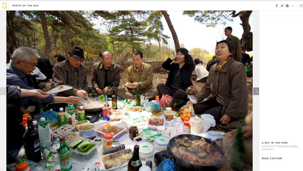
National Geographic Website Magazine contains mainly of articles about geography, history, and world culture. When you visit the online magazine, at the top of the screen, one can find a variety of options to choose from.The menu title allows you to further explore the content of the webmagazine not just articles, but also their online shop, books and even educational programs. Users can sign in using the sign-in button while new users can subscribe if it’s their first time visiting the site. The website’s primary colours are black, yellow, white and also a dark shade of grey. The text font used is a neat sans serif font, which can easily be read because of the contrast between the colours (white.yellow and grey on a black background) Underneath the menu/title bar, one can find several more options to choose from such as the “Latest Stories” published and also “Photo of the day” A search button is also provided, making the webmagazine more user friendly and easy to navigate through.

Screenshot_3.png
Menu/Title bar


Screenshot_4.png
The screen you are prompted with when clicking on “Explore Nat Geo”


Screenshot_5.png
Photo of the day option


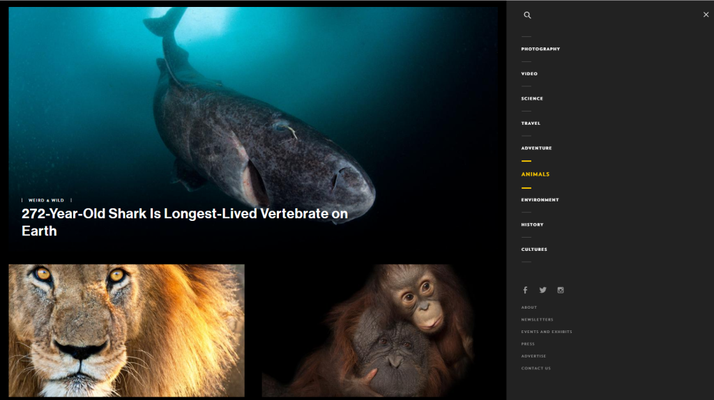
In the top right corner, just underneath the country option, the user can click on the icon to be prompted with a screen which has more articles and a vast variety of topics that he/she can choose from. The page is split into 2. On the right hand side are the topics the user can choose from (white text on dark grey). Hovering over a topic changes text colour to yellow. Furthermore, additional options such as the about page and contact us page are also included, having a slightly smaller text size. On the left hand side of the page, we find the articles with regards to the chosen topic. I really love the hierarchy here, with each topic equally having ‘x’ number of articles to click on, using interesting titles and images, with the first 1 having a larger width/height plus text size and the ones after split equally into 2 columns.

Screenshot_6.png

Moving on…one small thing which I do not like, is how the white space is used in the first section of the website. The articles are not centered in the middle of the page which I find a bit annoying. See image below.

Screenshot_3.png


Continuing scrolling down, one can find more articles to read. They are split into 3 columns, using proportionate spacing. Screenshot_4.png

At the end of the webmagazine, one can find previous issues, follow up on events, exhibits, subscribe to the newsletter, advertise etc etc.

Screenshot_5.png


Articles are well structured, making good use of paragraphs and text font/size/boldness as an example seen below. Videos are embedded within certain articles as well. At the end of an article, one can also leave personal comments, making the webmagazine more interactive.


Screenshot_6.png


Screenshot_7.png

Application Review

ff.png

The magazine application review I chose is Photography: Nat Geo Traveller. It is a photography magazine offering a behind-the-scenes look at some of the fantastic travel photography from National Geographic Traveller (UK), including previously unpublished images from photographers around the world. It is an app filled with tips, tricks and tutorials from industry experts which covers everything from equipment to post-production touch-ups.

The app is very simple to use and is quite user-friendly. One can simply navigate from one article to the other by swiping left/right to select an article to read.

7.png
Choose which issue you would like to read to get started


6
Swipe left/right to navigate


Most articles use the same type of design elements. The hierarchy is done neatly, having a picture regarding the subject at the top of the page. After that, written in a black, bold and large font is the title of what the article is about. Following that, a piece of text on a white background colour, further explaining the topic at hand and/or giving extra information is placed underneath the title. It is written in Italics and uses a smaller font than  the title.

3


The content is then placed afterwards, with the text having a small font and placed on a light gray or white background. The text is separated into paragraphs if the article is too long in order to get a bit of a breathing room between the text. This makes the article more enjoyable to read instead of having a whole chunk of text which makes you give up reading it. In certain articles, images or even videos are placed in the middle of the text relating to the topic, making it more interactive. Some images contain captions as well. Links are found which one can click on throughout the articles, leading the user to a different page for example the facebook page of the photographer. These are written in Italics and a red font in order to be distinguished as a link. Some articles also contain subtitles which uses a larger font size and is written in bold.

1                                                 2

Last but not least, another navigation method one can make use of is by clicking on the icon found at the top-left corner, where a drop down menu appears in which the user can choose an article without the need to have to swipe throughout all of the articles. It uses a black background with white coloured text and the chosen article has a yellow background colour with black text. Very simple and very elegant. I really love this magazine app.


5

Analyses of a Magazine


  • The magazine title “MOJO” is consistent and uses same text format like they did through all previous issues. It is best to always have a consistent logo, 1 which by time starts to get more familiar with the readers.
  • Bright pink colour used to highlight and give importance to some text more than the white text.
  • A few quick teasers to attract the audience of some of the articles that are found inside. The less text used the better and for example you can see the text “We wanted to be Kiss!” this arouses curiosity and makes you start asking questions like “So what happened?”
  • Large image of a celebrity looking surprised as front cover image.
  • Small image on top left corner of magazine


  • Full bleed image with a double page spiral
  • The text font is Bold and kind of gives you the 70’s feel.
  • Mixed colour shades and with a radial pattern that also gives you the 70’s feel (reminds me of vinyls)
  • Notice how the article continues on the next page and you immediately know that the full bleed image from before is linked to the article on this page, just by looking at the first letter of the article which uses same text font.
  • Text is split into 2 columns with small – medium images to give breathing room and make it more enjoyable to read.
  • The first paragraph is not split into 2 columns and has a slightly larger text font to get the readers attention.

  • Use of black border with a brown padding for the 2 pages which automatically links them together.
  • 1/3 of the article in the first page is an image referring to what the article is about and the text is divided into 3 columns.
  • On the second page the text is divided into 4 columns
  • A piece of content with a different background colour is also included, but notice that same black and brown colour is used, suggesting that it is linked but in a different way, maybe its to show that it is just a piece of extra content, but makes it interesting to read.


  • Advertisements page which contains lots of different typography. Also used on the 2nd page. The advertisement on the first page is neatly presented with the 6 DVDs with their captions using consistent format.
  • Background colour green with a bright star logo to make the page more appealing.
  • The number 100 having a larger text font and different colour text to give importance and fill people with awe, when seeing that THAT is the number of pounds they are going to save.
  • On the second page, a collage of images, some bigger than others, set out by the most important, with text underneath explaining the image and who the artist is.
  • The footer of every page is also consistent throughout the magazine with only the colour of the text changing sometimes or the background colour.