Category: Digital Media in Visual Arts

Pixel Perfect Precision

You want your product to be the best and so having each pixel perfected is the way to go if you want your design to make a bang!

In this post, we go over some of the principles one needs to be aware of. These include:

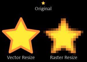
  • Sharp Edges are important. Blurry edges does not cut it.
  • Alignment and spacing between objects and materials must be complementary
  • Consistency in positioning of common items throughout different screens such as title bars, back buttons, footers etc.
  • Environment. Tests using different platforms is a must before launching your product to the users to see how they are viewed on different interfaces.
  • Accessibility meaning that the product you are designing is simple to use and easy to navigate through and people with disabilities are catered for.
  • Affordance which makes the design of your product easier to interact with the user, for example buttons with depth hinting that it can be pressed just like in the real world.
  • Colours and shape. It is very important not to confuse the user by making correct use of colours and shapes for example a very good sign should be coloured green and not red, because that is what we are accustomed to.
  • Visual Hierarchy which influences the order in which the human eye perceives what it sees for example the contrast and text weight used.
  • Typography where good font size and line lengths play an important role.
  • Testing. As mentioned previously, it is of great importance to actually use the different platforms to see how they are viewed since these can vary from one platform to another.
  • Organisation. Organising your own work to make the life of other people easier will make them very happy.

These are the main principles each designer should take into consideration when designing a product to make it pixel perfect.

06_from_birds_point_of_view.png


Post-Perfect-Pixel.jpg


References

Vk.com. (2013). Pixel Perfect Principles.pdf. [online] Available at: http://vk.com/doc-36495620_181691410?dl=c167ce4e267d05448a [Accessed 18 Oct. 2016]

Analogous and Complementary Colours

Have you ever been unclear and indecisive in what colours you should make use of in order to catch the eye and make something such as a website, pleasing to look at? Well, this is where one needs to make use of harmonious colours. For analogue colours, if we pick 2 or 3 colours which are close to each other in the colour wheel, for example the Blue-Green, the Green and the Yellow-Green, these match quite nicely, is pleasing for the eye and has a rather serenic effect!

Color-Wheel-Post.jpg


Furthermore, one can also match colours by using the “opposites” so to speak on the colour wheel. So for example Green and Red (complementary colours) or Yellow-Green and Red-Violet. These colours, when put together, are easy on the eye and can be put to good use when you want to make something stand out.


FIG13-03c.gif


References

Tigercolor.com. (2016). Basic color schemes: Color Theory Introduction. [online] Available at: http://www.tigercolor.com/color-lab/color-theory/color-theory-intro.htm [Accessed 07 Oct. 2016].

How the eye perceives colour

Light is colourless and the human eye detects the colour by translating light through our pupil. The reason why we can distinguish one colour from another is thanks to our specialized cells in our eye called rods and cones which are found on the outer layer of our retina. Rods are responsible for shades of light and dark while cones are responsible for the colour perception. Light receptors transmit messages to the brain which helps us see colour. When light hits the surface of an object some colours are reflected back, while other colours are absorbed. Furthermore the white light is also refracted, scattered, or diffracted. For example if we had to take a cherry, the way we see its red skin is by having its surface absorb the green and blue colour and reflecting red to our eye.

Humans are only able to see a fraction of the whole spectrum while other mammals such as birds and fish are able to perceive colours which humans are not able to, including ultraviolet colour. Also other mammals can see less colours than humans do such as dogs so in a nutshell, the more cones we have, the more colours we are able to perceive.


References

YouTube. (3 April, 2014). How Do We See Color?. [online] Available at: https://www.youtube.com/watch?v=pvC9MQvqHMQ [Accessed 18 Oct. 2016].

Pantone.com. (2016). Color Think Tank – How Do We See Color?. [online] Available at: https://www.pantone.com/how-do-we-see-color [Accessed 18 Oct. 2016].

Pantone Colours

Pantone is a color matching system (PMS) or ‘spot colour’ used for identifying colours, by using a specific name and code  and is used in the graphics, print, and publishing industries. Pantone colours were created to aid artists, designers, industries and manufactures easily identify and communicate a certain colour.

‘What you see is not what you get’. This is an important quote to keep in mind when we’re dealing with printing colours. On a screen, a colour may appear one way, bright and luminous, but when printed, a colour may come out different than what was expected. This is where pantone comes in, where the client shows the designer the colour and in order for the colour to come out specifically to the client’s needs, the designer uses a pantone solid formula guide until the correct colour which the client wants is found. By using this technique, both on-screen and printed colour will remain the same. A pantone colour chip is used to guide the press operator print the correct colour and the final product is delivered.

This technique helps many companies to consistently match their colours throughout their whole campaigns.


printer-with-eyeglass.jpg

f044d93d4100cf78e40de151bed124c5.jpg


References

“How Pantone Works”. Colorguides.net. N.p., 2016. Web. 18 Oct. 2016.


Raster vs Vector

There are 2 main type of image files: Raster and Vector. In raster graphics, images are made up of thousands, even millions of pixels. A pixel is a word derived from the word ‘picture element’ and the more pixels an image has, the better the resolution and the clearer the image. Each pixel is made up of 1 single colour, but they can be so small and close together, that they appear to be connected. In raster graphics, when the image is scaled up and enlarged, the image starts to become pixelated and blurry. This is because a raster image has a finite number of pixels. Raster is mainly used when working with photographs and are commonly used for all graphics once they are published digitally. Raster graphics are measured in pixels per inch (ppi) ; an amount of pixels within each inch.  An example of a software program which uses raster graphics is Adobe Photoshop.

In vector graphics, images make use of mathematical calculations, using thin lines, objects and curves known as paths and this type of graphics allows the user to scale and enlarge an image as much as he/she’d like without losing quality. This type of graphics gives the image a more cartoonish look compared to raster. Vector is most suitably used when working with text or logos and other illustrations or when working with engravings and vinyl cut-signs. An example of a software program which uses vector grapics is Adobe Illustrator.

raster-vector-comparison1.jpg

VectorVsRaster-300x214.png

References

Design Shack. (2016). Vector vs. Raster: What Do I Use?. [online] Available at: https://designshack.net/articles/layouts/vector-vs-raster-what-do-i-use/ [Accessed 18 Oct. 2016].

Blogger, G. (August 12, 2012). How To Explain Raster vs. Vector To Your Clients. [online] UCreative.com. Available at: http://www.ucreative.com/articles/how-to-explain-raster-vs-vector-to-your-clients/ [Accessed 18 Oct. 2016].

Print Method: Flexo

Flexography printing is mostly used for printing on packages such as plastic shopping bags, milk cartons, food and candy wrappers and disposable cups and it is the cheapest and most simple form of printing process for packaging. Flexography makes use of flexible printing plates made of rubber or plastic. Flexo uses a relief plate in order to print, where the letters and print makes use of a protruding, jutting out surface. This is where ink will be applied, while the recessed surface is the non-coloured part of the image. Only the raised (relief) images come in contact with the substrate during printing. If a printing package requires 5 colours, then 5 different printing plates would be needed; 1 for each colour. The fountain roll picks up the ink from the ink tray, sends it to the anilox roll which provides a controlled amount of ink to the printing plate by use of tiny engraved cells, which are being held by the plate cylinder and finally, an impression cylinder transfers the image onto the substrate by applying pressure to the plate cylinder.

This printing method is not suitable for images which require high quality printing or cases where the use of small text font with a certain typography is used, since quality can easily be lost in the process. On the plus side, the type of ink used in this printing method has a low viscosity which is beneficial for the ink to dry faster than offset printing and so results in faster production.

Coating, cutting, folding and binding of the image produced, are all part of the process after the print is finished.

References

YouTube. (14 March, 2013). Inside Jobs – Flexography. [online] Available at: https://www.youtube.com/watch?v=eGzU8k5mmdA [Accessed 17 Oct. 2016].

Pneac.org. (2016). Printing Process Descriptions: Environment and Printing: The Printers’ national Environmental Assistance Center: PNEAC: The Environmental InformationWebsite for the Printing Industry. [online] Available at: http://www.pneac.org/printprocesses/flexography/ [Accessed 17 Oct. 2016].

En.wikipedia.org. (2016). Flexography. [online] Available at: https://en.wikipedia.org/wiki/Flexography [Accessed 17 Oct. 2016].

Print Method: Gravure

Gravure is an expensive, high quality and sharp imaging print method. The cylinders are usually made of steel, plated with copper and each cylinder costs around $5000 and so this type of printing is mainly used for high end and long run printing. The images are etched and engraved onto the cylinders using a laser beam or a diamond tool with the cells or small recesses being filled with ink from the ink fountain found underneath the gravure cylinder and then transferred onto the paper, while raised (non-printing) portions of the plate or cylinder are wiped or scraped free of ink with a doctor blade, leaving the ink only in the recesses. There are usually 4 printing units through which the image is passed (Cyan, Magenta, Yellow, Black), although this can vary and more units can be used to apply a different colour.

rotot.jpg


After each print, a gas fired or electric fired drier is used to dry the paper, since the ink can be easily smeared or smudged. This is done after after each colour is app
lied and is passed onto the next printing unit. Rotogravure cylinders has a long lasting life and images do not degrade in quality that easily.

hnhj.png

References

YouTube. (6 March, 2013). full process of rotogravure cylinder production by Janoschka. [online] Available at: https://www.youtube.com/watch?v=5hb3EKQv4ic&list=PLpKBzuUUTWYQkPjJs_o5UkmeJyRrZMha1 [Accessed 17 Oct. 2016].

En.wikipedia.org. (2016). Rotogravure. [online] Available at: https://en.wikipedia.org/wiki/Rotogravure [Accessed 17 Oct. 2016].

Bear, J. (2016). Your Packages and Your Wallpaper May Have This Printing in Common. [online] About.com Tech. Available at: http://desktoppub.about.com/cs/printing/g/gravure.htm [Accessed 17 Oct. 2016].

Pneac.org. (2016). Printing Process Descriptions: Environment and Printing: The Printers’ National Environmental Assistance Center: PNEAC: The Environmental InformationWebsite for the Printing Industry. [online] Available at: http://www.pneac.org/printprocesses/gravure/ [Accessed 17 Oct. 2016].

Print Method: Offset

Offset printing or Offset Lithography, is the most common type of printing in the printing industry, mainly used to print a vast variety of products, including cards, stationery, leaflets, brochures, magazines, and books. 2 immiscible liquids are used for the printing process; the ink which is an oily substance, and the parts where the paper contains a thin layer of water, which repels the ink and leave those parts blank.

Offset Printing uses the 4 main colours of printing CMYK (Cyan, Magenta, Yellow and Black). The 4 print units are first loaded evenly with the ink, each unit having 1 colour. The sheets of stacked paper are then sent through the printing press, 1 sheet at a time and passes through the dampening unit, where the non-printed areas are dampened with a mixture of water and other chemicals, so that those areas will repel the oil-soaked ink. After that, the printing press sends the sheet to the first inked printing unit and ink is applied to the image-part area. Grippers then send the sheet of paper to the next printing unit where the second colour is applied.

ik.png

dsesd.jpg


After they pass from each unit, the sheets are still wet at this time and so an anti set-off powder is used between each sheet to avoid sheets being smudged. After the sheets have dried, they are then collated together, binded and cut to size, with the client’s desired dimensions. Offset printing is worth making use of for high quantities of print, since the set-up is very expensive and so this will get you back the money’s worth.


offset-printer.jpg

References

Prepressure.com. (November 22, 2015). Offset printing | How an offset printing press works. [online] Available at: https://www.prepressure.com/printing/processes/offset [Accessed 17 Oct. 2016].

YouTube. (27 May, 2013). The Printing Process – Sheet Offset Press – English. [online] Available at: https://www.youtube.com/watch?v=RW1HJdW5XLs [Accessed 17 Oct. 2016].

Screen vs Print Design


Screen and Print Design may have a lot in common, but can be a completely different experience from each other. For instance let us take the example of a book. Som

Kindle-VS-Books.jpge people may prefer to use the interactive way to read a book by using kindle (e-reading), it is very easy to buy books using kindle and portability is a sure plus. Weight is not a problem and you can have as many books as you want stored on kindle. Others however, prefer to physically hold the book and get the printed feel of it. Me personally, I love the ‘real’ books (The printed version so to speak). It is kind of hard to put into words, but the feel of paper feels good in my hands and I just love
it when I buy a new book and the smell of new paper hits my nostrils. This is what is meant by the term ‘different experience’.

And so although the interactive way of viewing information and material on screen is becoming popular and in some aspects even replacing the printing method, it is quite hard to imagine a world where only screen design exists. The printed method is still very much popular. Magazines and newspapers for instance are still high in demand. Everyday, new magazines and newspapers come out and are bought.

There are a many other forms of printed design material. These include brochures, pamphlets, greeting cards, business cards, product packaging and logos.

As for screen design, examples include websites, animations and the touch screen car menu, showing several different options one may choose from such as turning on GPS or playing music.

touch-screen-car-stereo.png


The audience

Who, what and why? The 3 main questions you have to ask yourself before starting your design. The first question. Who is the audience you are targeting? Are they of a small age? Are  they teenagers? Elder people? Business people? These are important questions you need to ask yourself before starting the design. For example if you are to design a product which is targeted specifically at teenagers and this product has a logo with a name on it as a print design, you are going to make use of a different typography than if you were to design a product suitable for preschoolers.

The second question. What is the aim of the project? What is trying to be accomplished? The design of the product is of great importance and so knowing what the goals are for the final product is important too. Using a screen design example, if for instance you are designing a website to sell a product or a service, the design has to be simple and easy to navigate through, preferably with a menu for ease of navigation and comfort for the user. Users will easily lose interest in looking at your website if they find it difficult to use and for this reason, web designers should take every measure to ensure this does not happen and keep the user’s attention by making them delve deeper and explore your site. This can be accomplished by animation, sound and interactivity on your site.

The third question. Making use of a print design example, we ask the question why should I use one texture, shape, size and layout of one design over the other. For instance, if you were to design a printed business card to a firm which deals with architecture, it would be a great and suitable idea to make use of a felt paper texture. This would give the correct feel you get associated with architecture.

arc.jpg

steam.jpg

References

Kliever, J. (April 8, 2015). Graphic Design for Print vs The Web: 15 Vital Differences You Need To Know About – Design School. [online] Design School. Available at: https://designschool.canva.com/blog/print-vs-web/ [Accessed 13 Oct. 2016].

Miller, E. (February 4, 2016). How is Designing for the Web Different than Print?. [online] About.com Money. Available at: http://graphicdesign.about.com/od/printvsweb/a/print_vs_web.htm [Accessed 13 Oct. 2016].


CMYK vs RGB

Starting off on CMYK…many of us have heard or seen this term being used on either certain software programs such as Adobe Illustrator or maybe used as an advert.


CMYK used in Illustrator

Despite being a popular term, many fail to note what the letters CMYK stand for. CMYK is an abbreviation for Cyan, Magenta, Yellow and Key (Black[which is not really a colour in itself, but rather black being the abcense of light]). CMYK is a type of colour model which is much more limited to shades of colour.


RGB on the other hand, which stands for Red, Green, Blue has a much bigger colour spectrum than CMYK, which is the reason why sometimes what you see on a display monitor to that of what you see on a piece of printed paper, can differ a great deal. The RGB is mainly used for computer monitors or television sets. This gives us a conclusion that the RGB spectrum has millions more colours than the CMYK.


If however, you are looking to print an illustration, then CMYK is the best option.


We can say that CMYK is sort of an opposite to the RGB model. This is due to the fact that in CMYK, we subtract the brightness from the white colour or in other words we subtract different shades of red, green and blue since those 3 primary colours together make the colour white by using what we call “inks”, however in the RGB model we make us of the additive colours which we call “lights” (the red, blue, green) and if for example you add red or green or blue (one of the primary colours) this gives us a different shade of colour.

References

Crux Creative. (2012). RGB VS CMYK: WHEN TO USE WHICH AND WHY. [online] Available at: http://cruxcreative.com/rgb-vs-cmyk-when-to-use-which-and-why/ [Accessed 7 Oct. 2016].

Van Holten, D. (2016). RGB versus CMYK. [online] Printernational.org. Available at: http://www.printernational.org/rgb-versus-cmyk.php [Accessed 7 Oct. 2016].

Morton, J. (2016). Color Systems – RGB & CMYK. [online] Colormatters.com. Available at: http://www.colormatters.com/color-and-design/color-systems-rgb-and-cmyk [Accessed 7 Oct. 2016].